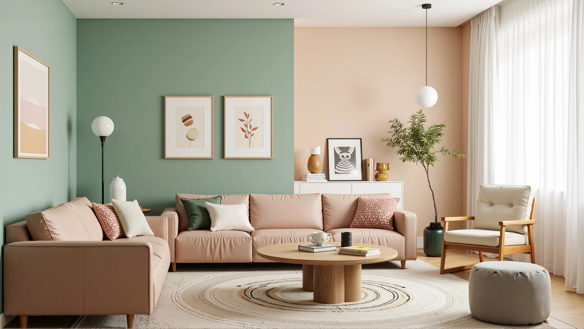
Color isn't just something you "add" at the end of a project. It's one of the very first decisions that shapes how a space feels,moves,and lives. And lately,more homeowners and designers are realizing that neutral-only interiors don't tell much of a story anymore.
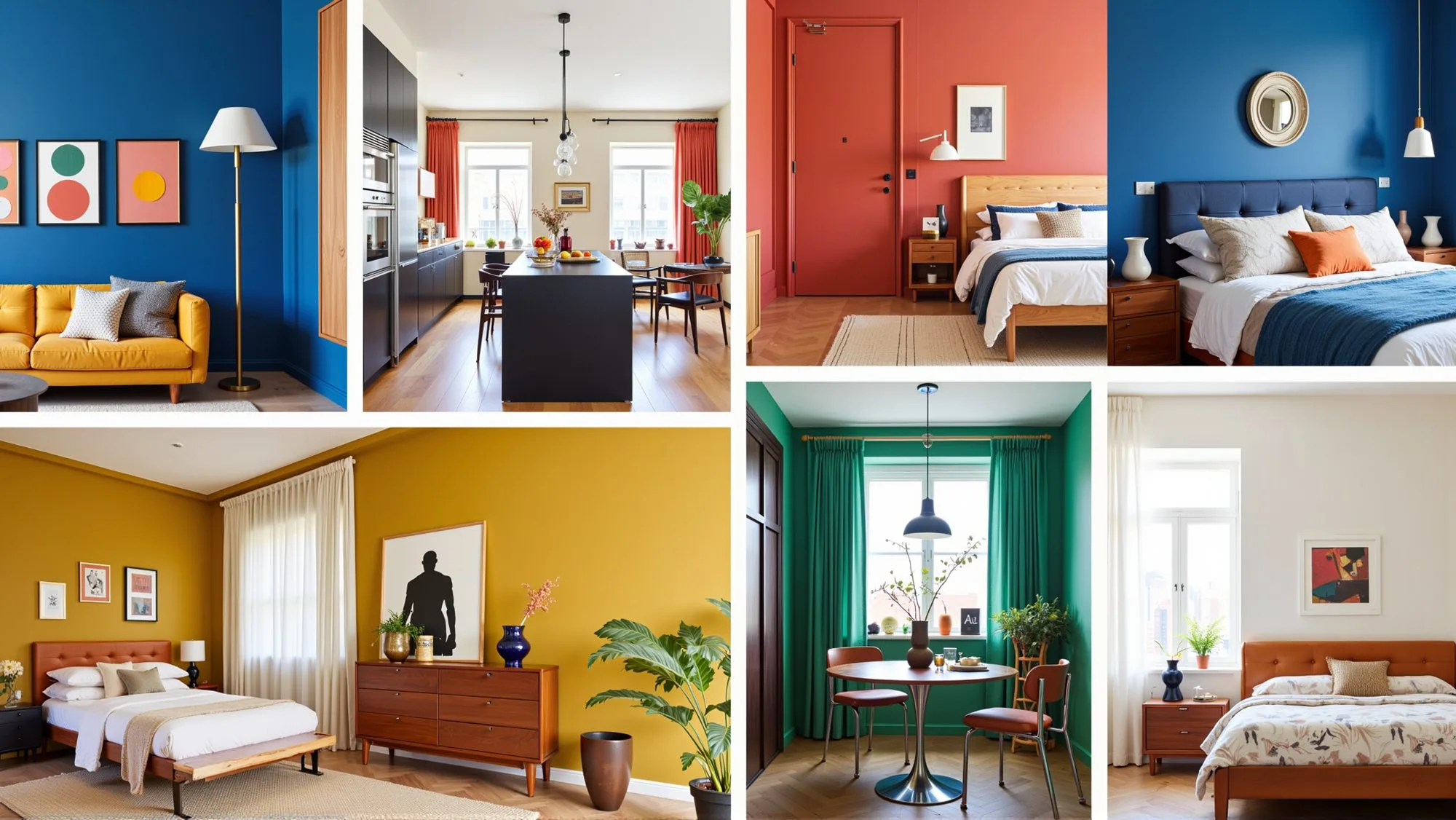
Bold color schemes are stepping back into the spotlight—not as loud trends,but as thoughtful design tools. Whether it's the softness of a Macaron color scheme or the fearless energy of the Memphis color scheme,these palettes help interiors express personality instead of playing it safe.
 BOLD COLOR SCHEMES
Sometimes you ease into color. Other times,you jump in headfirst. Either way,bold design doesn't have to be reckless. When done right,it just works.
What Makes a Color Scheme "Bold" in Interior Design?
A bold color scheme isn't about using the brightest shade in the paint store. It's about intentional contrast,clear visual hierarchy,and knowing exactly why a color is there.
Bold interiors usually share a few traits:
- Colors that contrast clearly rather than blend quietly
- Palettes inspired by art movements,culture,or history
- A sense of confidence—nothing feels accidental
That doesn't mean every wall needs to scream for attention. In fact,bold colors work best when they're paired with calm layouts,simple materials,and good lighting. That's the balance point—and that's where great design lives.
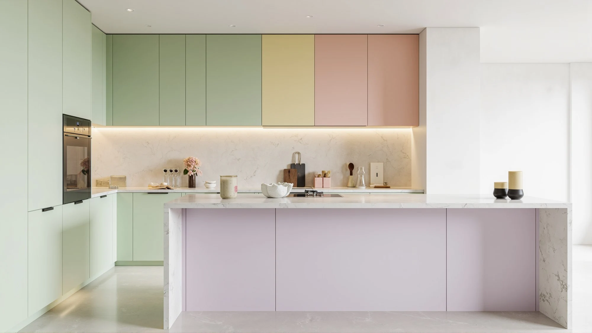
Macaron Color Scheme: Soft,Sweet,and Surprisingly Strong
The Macaron color scheme is often underestimated. Pastel pinks,pistachio greens,soft yellows,and airy blues may look gentle,but together they create a clear,upbeat visual identity.
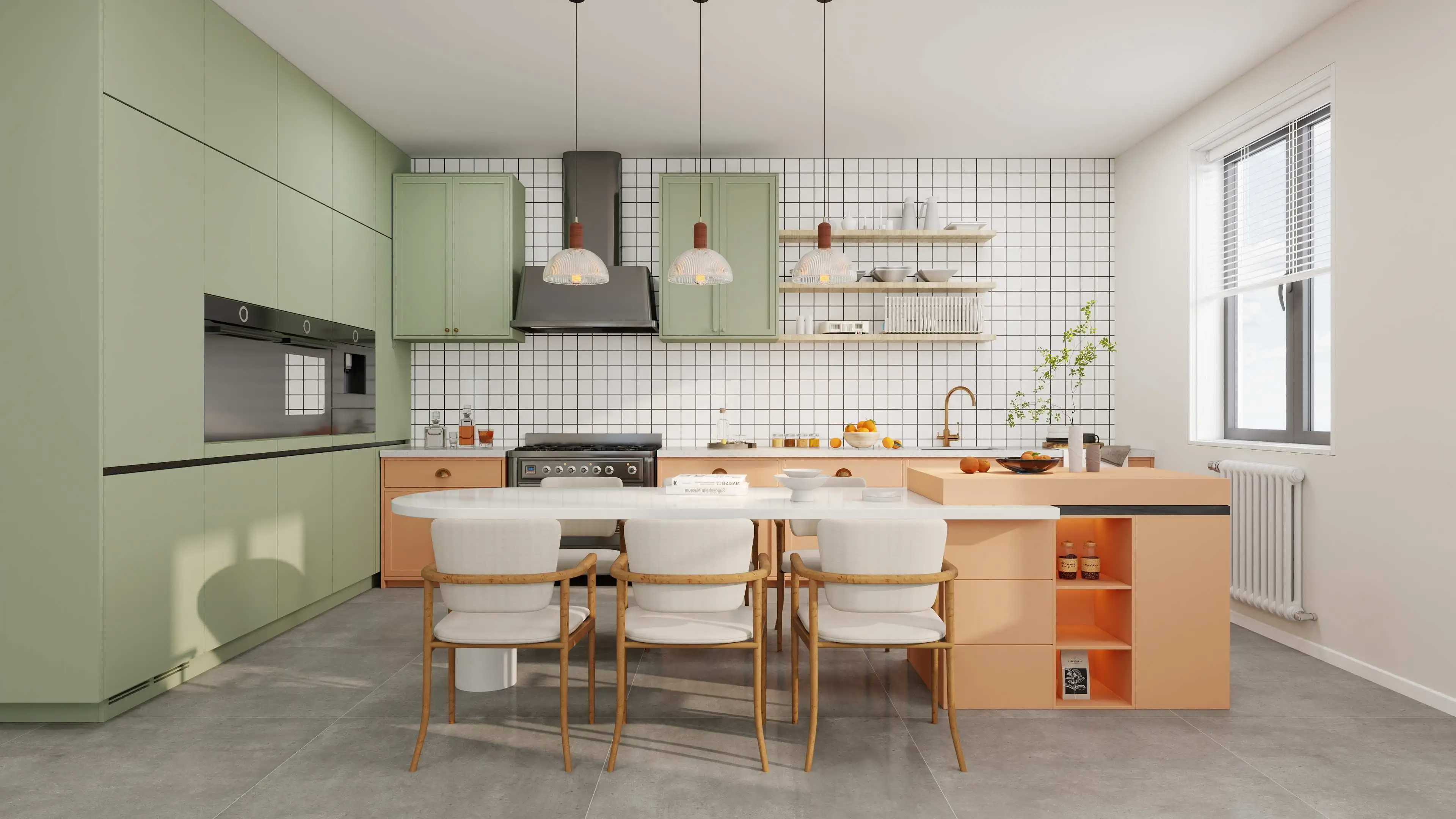

Inspired by French patisserie colors,this palette feels optimistic and modern. It's especially effective in:
- Kitchens and dining spaces
- Kids' rooms that still feel grown-up
- Small apartments that need lightness
 MACARON COLOR SCHEME
If you're unsure where to start,here's a practical tip: limit yourself to three macaron tones and anchor them with one neutral. That's usually enough to keep things playful without tipping into chaos. When people say pastel interiors feel "too sweet," it's usually because there's no structure holding them together.
 PASTEL MACARON COLORS
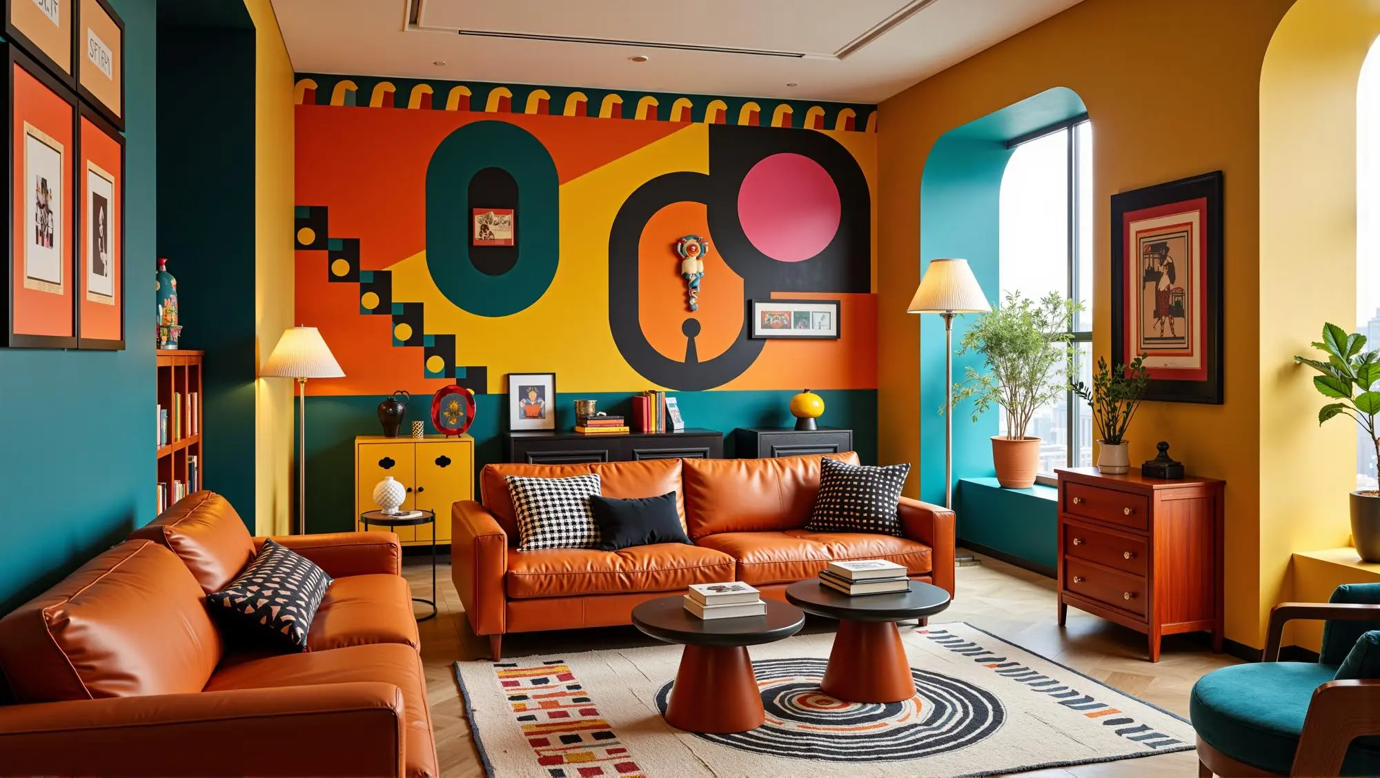
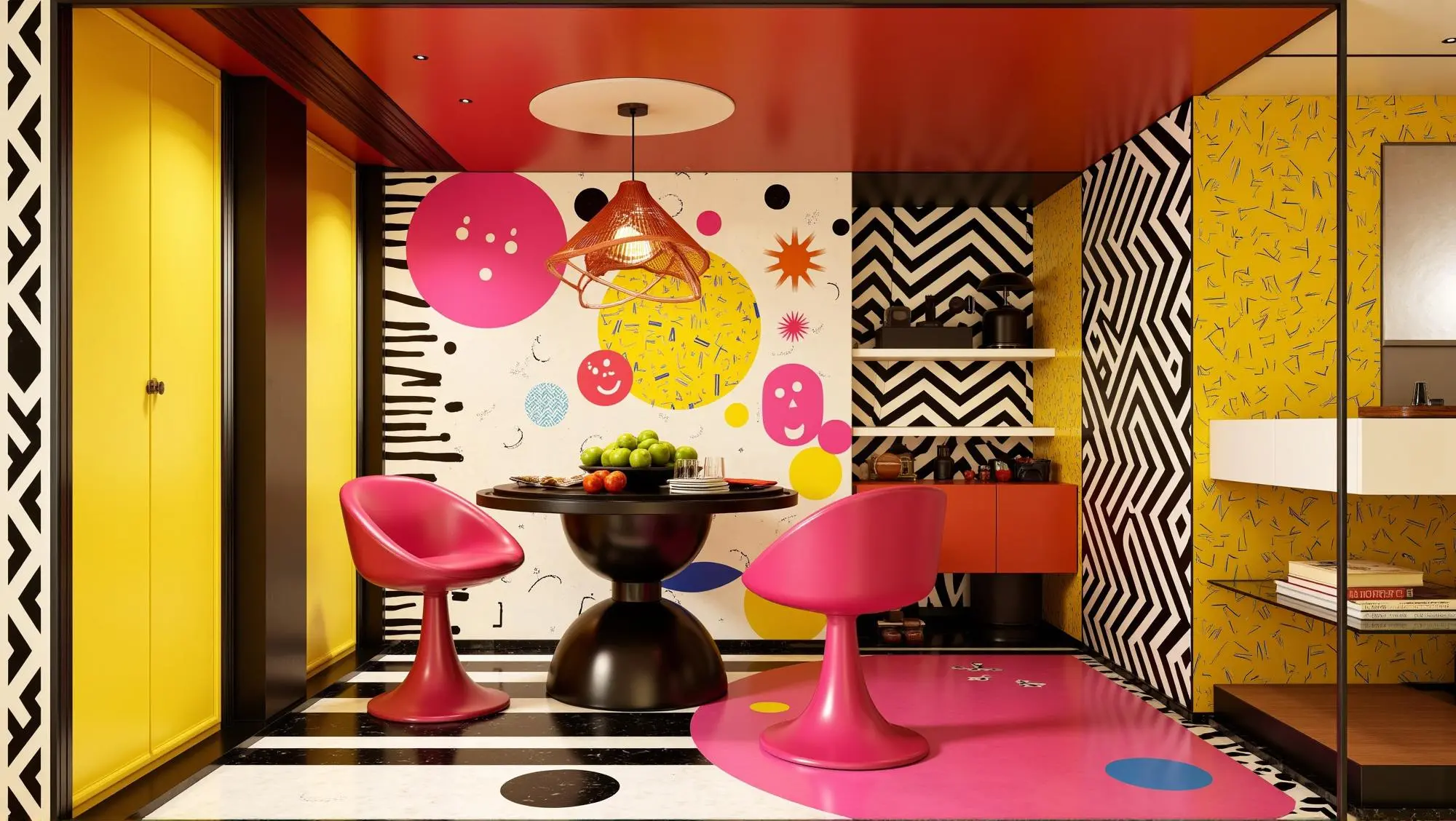
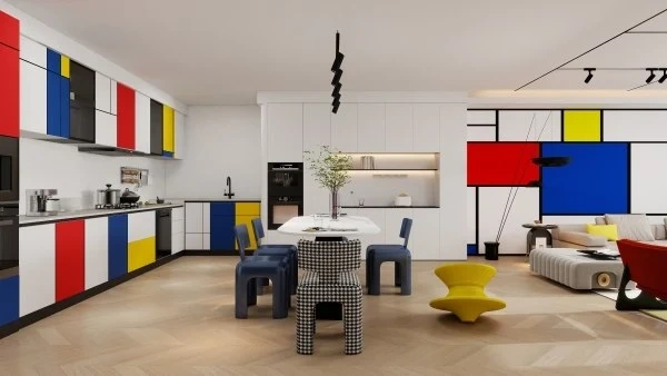
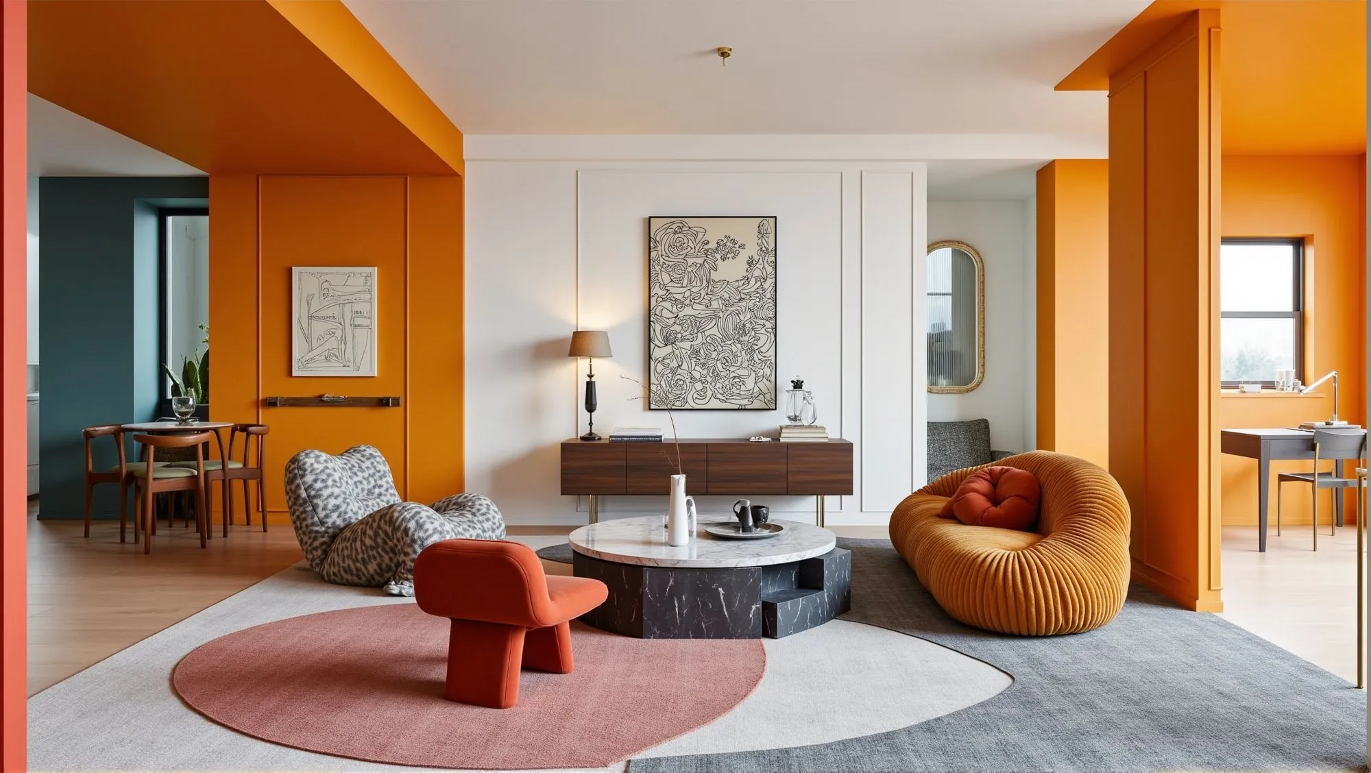
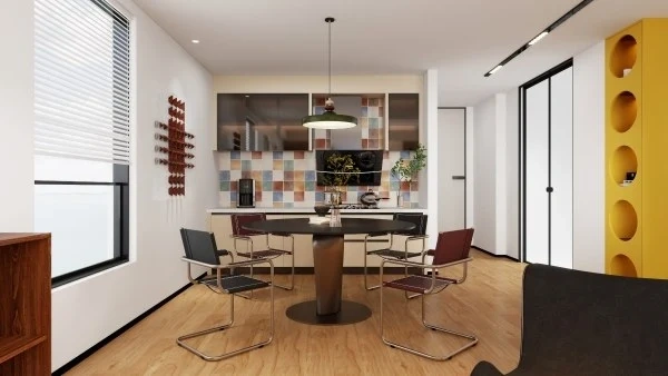
Memphis Color Scheme: Loud,Playful,and Proud of It
The Memphis color scheme doesn't whisper—it talks back.
Rooted in the Memphis design movement of the 1980s,this palette mixes bright primaries,bold patterns,and unexpected combinations. Red clashes with teal. Yellow interrupts everything. Geometry refuses to behave.
According to the Museum of Modern Art,the Memphis movement deliberately rejected modernist minimalism in favor of emotional,expressive design (MoMA,n.d.). That rebellious spirit is exactly why Memphis-inspired interiors still feel fresh today.
 MEMPHIS INSPIRED LIVING ROOM
If you're using a Memphis color scheme at home,restraint matters. Try:
- One statement wall instead of four
- Furniture as color anchors
- Plenty of negative space
 MEMPHIS COLOR SCHEME
Otherwise,things can go sideways fast. Still,when it works,it really works.
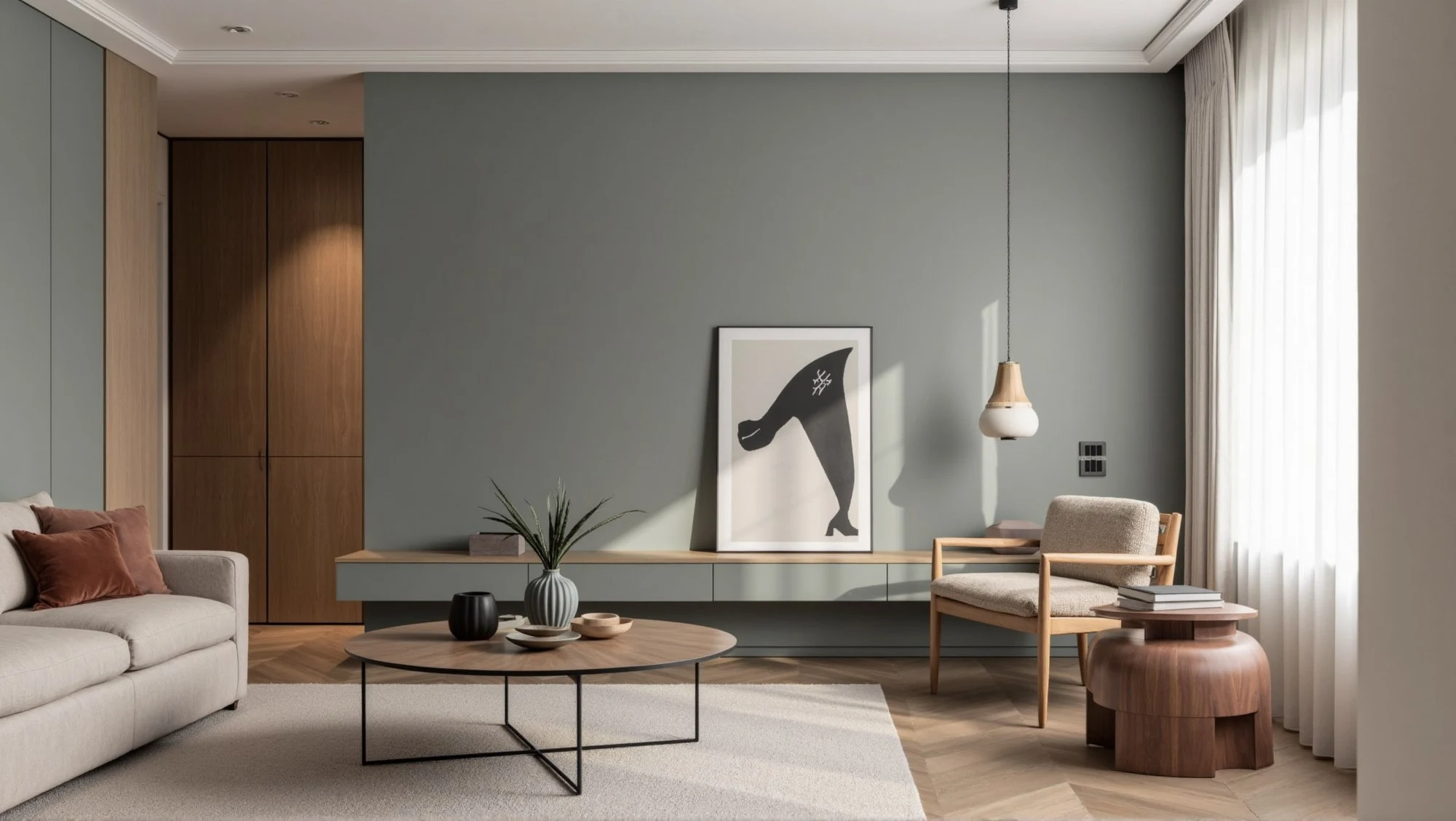
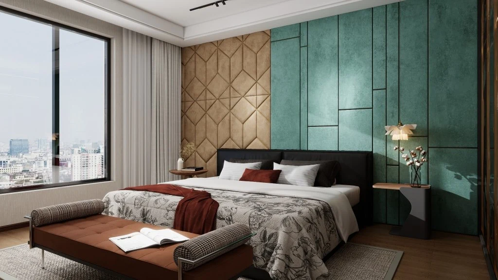
Morandi Color Scheme: Quiet Colors with Long-Term Appeal
The Morandi color scheme proves that bold doesn't always mean bright. Inspired by Italian painter Giorgio Morandi,these palettes rely on muted,dusty hues—soft greens,faded blues,warm grays,and clay tones.
 MORANDI COLOR SCHEME
Designers love Morandi colors because they don't burn out. You won't get tired of them after a year. They're ideal for:
- Living rooms
- Bedrooms
- Boutique hospitality interiors
If you want depth without drama,this palette is a safe bet that doesn't feel boring. It's subtle confidence—and that's harder to pull off than it looks.
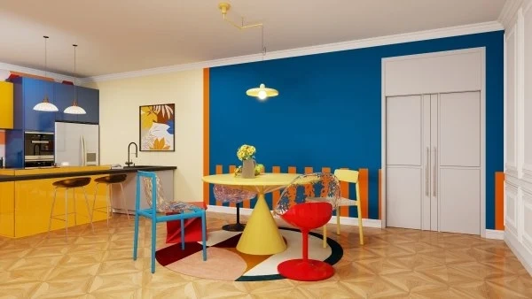
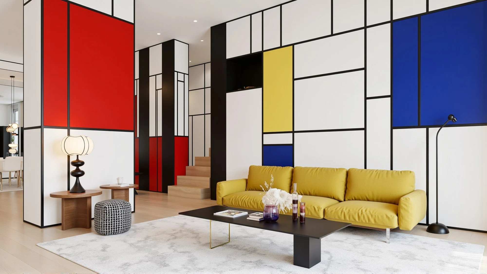
Mondrian Color Scheme: Color with Structure and Discipline
The Mondrian color scheme is bold by logic,not impulse. Primary colors—red,blue,yellow—are framed by black,white,and strict grids.
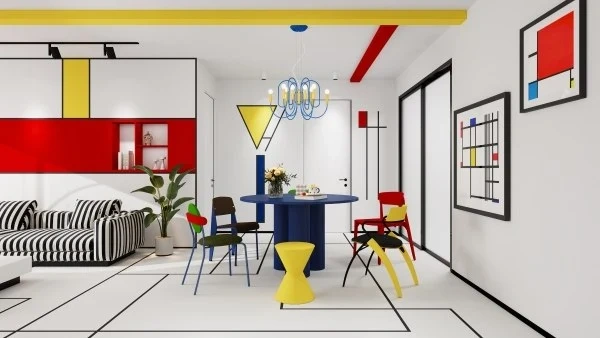
This approach comes directly from Piet Mondrian's belief that balance creates harmony,a philosophy that still influences modern design today (Tate,n.d.).
 MONDRIAN COLOR SCHEME
In interiors,Mondrian-inspired palettes work best when:
- Architectural lines are clean
- Furniture stays minimal
- Color is treated as structure,not decoratio
It's graphic,intellectual,and surprisingly timeless.
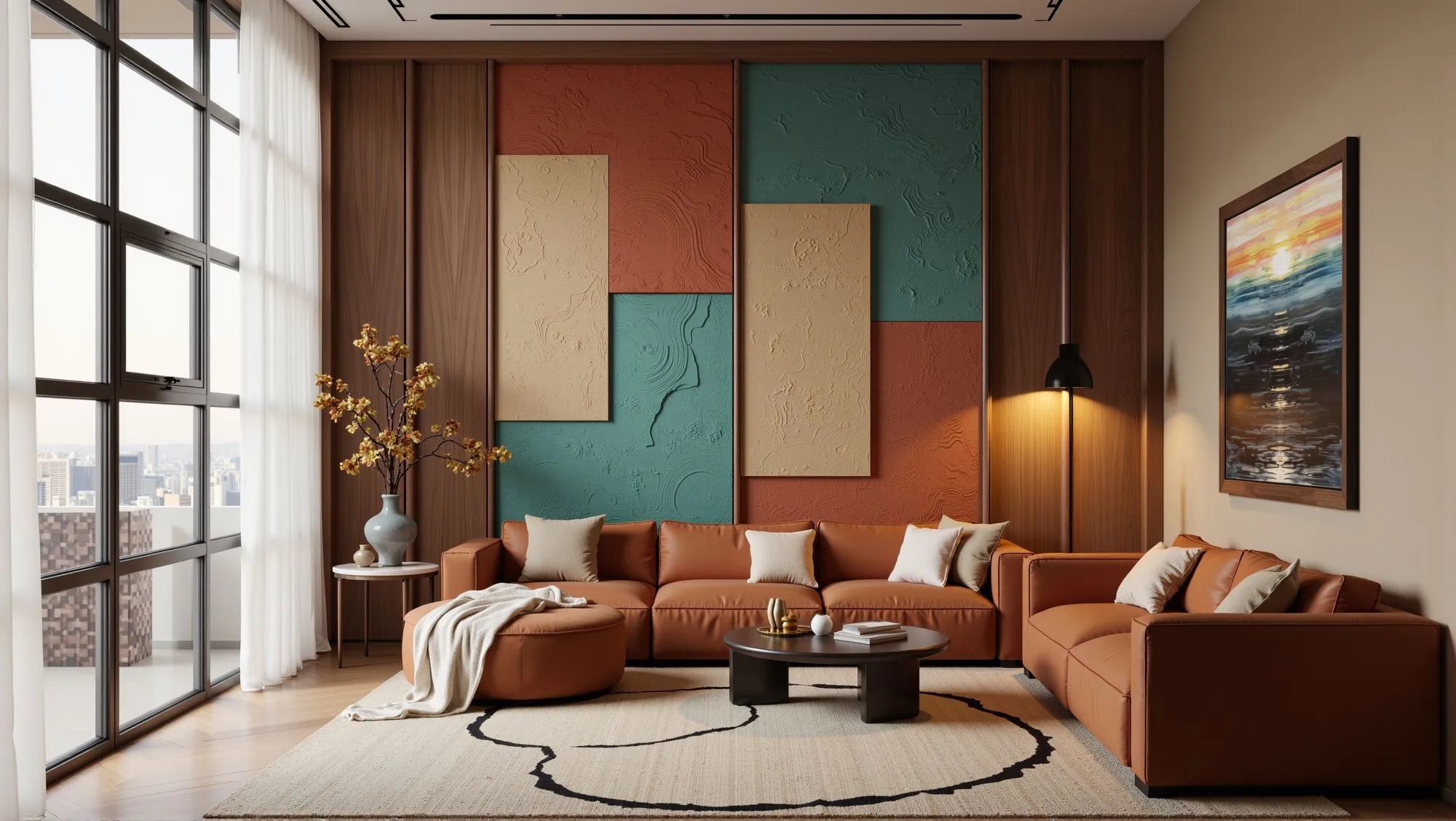
Dunhuang Color Scheme: History,Culture,and Earthy Richness
The Dunhuang color scheme draws from ancient murals along China's Silk Road,featuring mineral blues,muted reds,sand tones,jade greens,and aged gold.
What makes this palette special is its sense of time. These colors feel grounded,layered,and meaningful. Google Arts & Culture highlights Dunhuang murals as some of the most important cultural artworks in Asia,known for their rich symbolic color use (Google Arts & Culture,n.d.).
 DUNHUANG COLOR SCHEME
In modern interiors,Dunhuang colors pair beautifully with
- Textured walls
- Natural fabrics
- Contemporary furniture forms
It's boldness with depth—not decoration for decoration's sake.
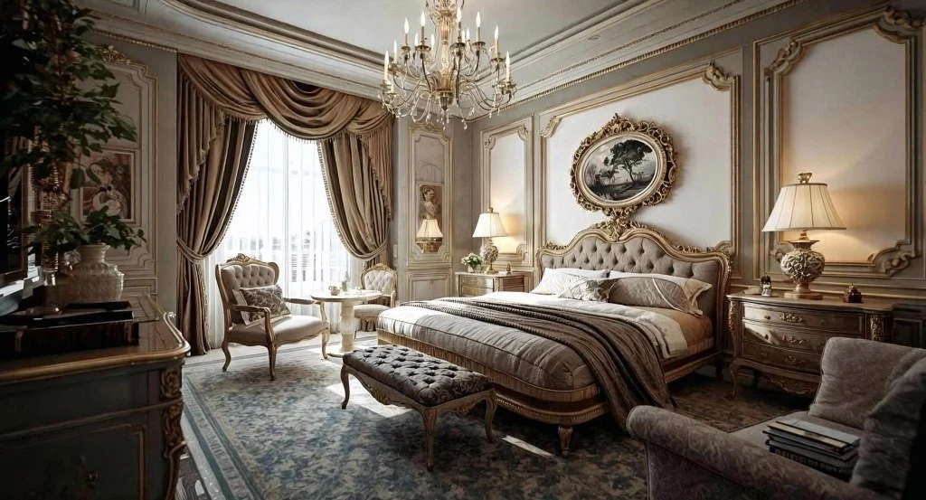
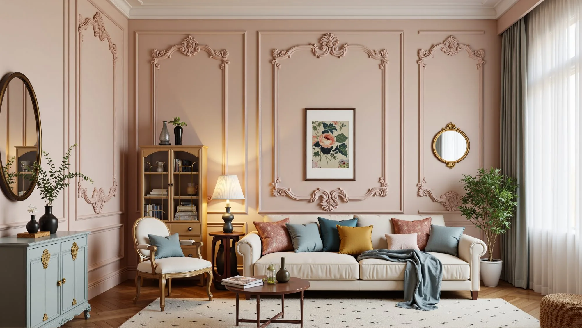
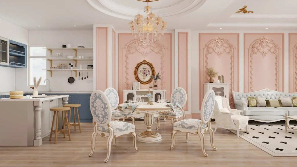
Rococo Color Scheme: Decorative,Light,and Elegantly Bold
The Rococo color scheme is often associated with luxury,ornament,and pastel drama. Think blush pinks,pale blues,creamy whites,and touches of gold.
Historically,Rococo emerged as a reaction against heavy Baroque design,favoring lightness and intimacy (Encyclopaedia Britannica,n.d.).
 ROCOCO COLOR SCHEME
Today,Rococo palettes work best in controlled doses:
- Powder rooms
- Dressing areas
- Accent spaces within modern homes
Used thoughtfully,they feel refined—not excessive.
Choosing the Right Bold Color Scheme for Your Home
If you're torn between palettes,start with how you live,not what looks good online.
 MIXING BOLD COLOR SCHEMES
Ask yourself:
- Do I want energy or calm?
- Is this a short-term statement or a long-term home?
- How much visual stimulation feels comfortable day to day?
You don't have to commit all at once. Start small. See how it feels. Bold color isn't about risk—it's about intention. And when intention leads,good design follows.